Monster World IV

Released in 1994 on the Mega Drive in Japan and tragically denied American and European gamers until it was given a digital release on the Wii, Xbox 360 and PlayStation 3, Monster World IV is arguably the best game in the series. This beautiful clay sculpture cover is one of the best Genesis box covers I've ever seen. Considering all the great Japanese box art that the Genesis has, that's speaking in volumes. The chibi versions of Asha are a cute touch.
Sonic the Hedgehog 2 (American Version)

More fantastic Genesis box art. The American version's cover art for Sonic 2 may very well be my all-time favorite video game box art. I just love the way Sonic and Tails are standing there looking like coolest duo on the planet with Robotnik crushing the top of the "2" behind them.
Super Mario 64 (American Version)

Super Mario 64's American cover is actually pretty similar to it's Japanese counter part. But since the American and European Nintendo 64 boxes are horizontal instead of vertical, about half of the small planet Mario is flying around is missing. Still, I've always appreciated what Nintendo of America gave us. Like Super Mario World's box art, we see Mario with (what was at the time) a new power-up, in this case, the Wing Cap.
Final Fantasy VII (American Version)

You know how Japan used to get all the swell box art back in the day? Well that wasn't always the case. Final Fantasy VII's American box art is infinitely better than the original Japanese January 1997's release. The American version takes an image of one of FFVII's promotional posters and switches it up a bit with a white background. We've got main protagonist Cloud, Buster Sword in hand, staring at the Shin-Ra corporation. I'm betting he's all outta bubble gum so that only leaves him with one thing to do. Sure we can't see Cloud's feet, but that's still a pretty powerful image. By comparison, the Japanese version is pretty vanilla. How vanilla? Take a look for yourself.
Gunstar Heroes (Japanese Version)

Treasure's very first game is a good contender for the best action title for the Genesis. The Japanese version was given some gorgeous hand drawn artwork showing the main characters and five of the reoccurring bosses, including fan favorite Seven Force pilot, Green.
Street Fighter Alpha 2

The most famous of Street Fighter Alpha 2's covers. Akuma made his debut as a hidden character in Super Street Fighter II Turbo, but chronologically, this is the game where he showed up in the series' story. From the way he and Ryu are looking at each other, it looks like the ensuing fight is going to be vicious.
The Legend of Zelda: Ocarina of Time (Japanese Version)

I do like the gold covers with the game logos that Nintendo of American gave us for the longest time, but I'd be lying if I said the Japanese versions weren't anything special. The image of Link getting ready to ride off on Epona with a towering flame in the background is miles better than a giant logo on the box.
X-Men vs. Street Fighter (Japanese Version)
+Front.jpg)
I believe I've already mentioned how much I love hand drawn artwork. For the most part, Capcom has gone this route with most of their crossover fighters. Was I guess Wolverine Publicity was in full effect even in the late 1990s because there he is, front and center on the cover.
Mega Man 7 (Japanese Version)

Most Japanese Mega Man covers usually have the Blue Bomber with the faces of the Robot Masters of the game behind him looking all menacing. Rockman 7 continues this tradition, but this is by far my favorite Classic Mega Man box art. Keiji Inafune's art style had been improving greatly as the years went by and it's very apparent with this cover.
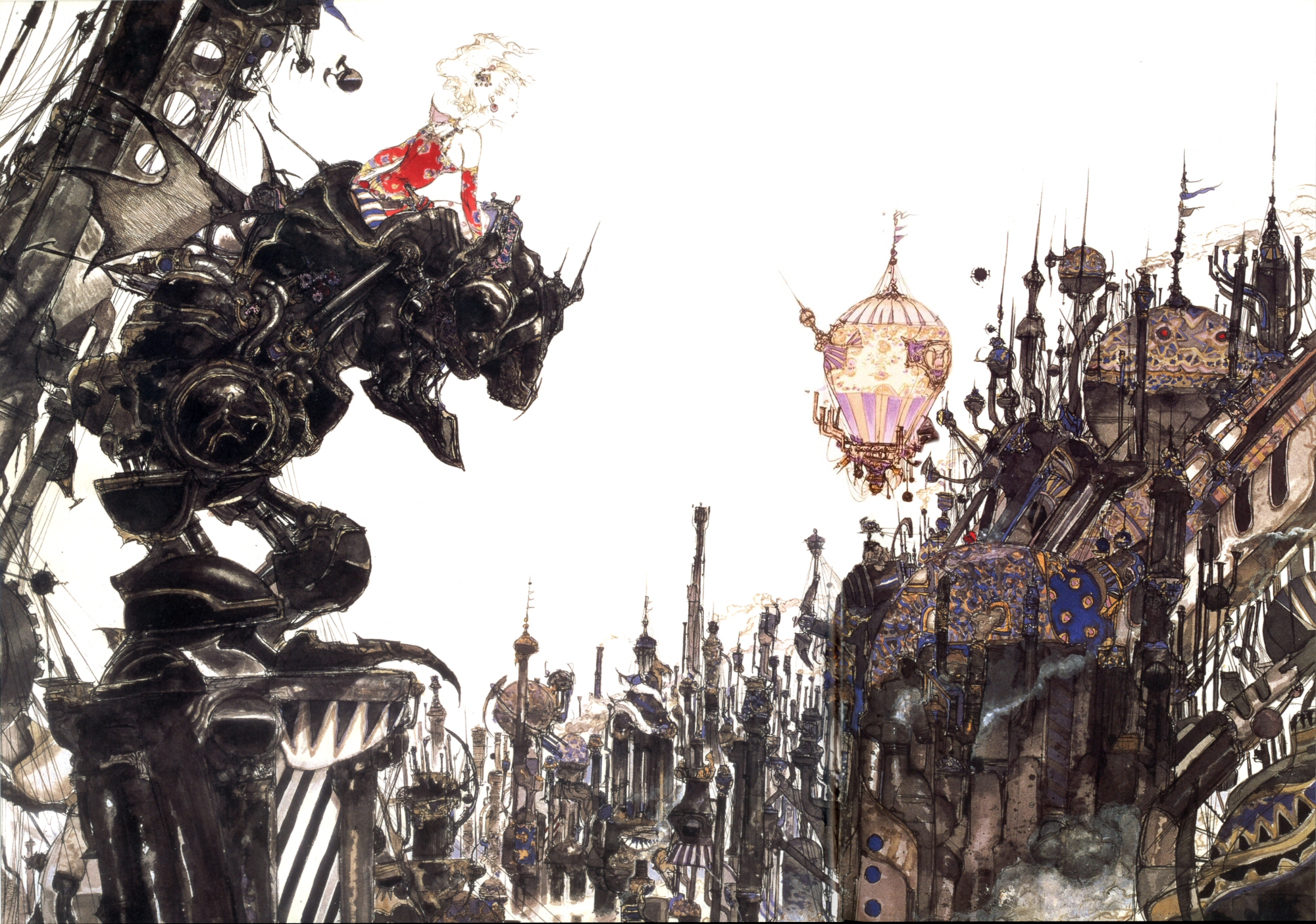
Final Fantasy VI (Japanese Version)

This won't be the first time you hear me gush over the astoundingly good artwork of Yoshitaka Amano. The man has a style unlike that of any other, one that is instantly recognizable. Amano has been involved with Final Fantasy from the series' humble beginnings designing characters, monsters, logos and even box art. The Japanese cover for Final Fantasy VI has Terra (Tina if you live in Japan) in Magitek Armor overlooking what I'm assuming is the Gesthalian Empire in Vector. Makes for quite the impressive image, don't you think? This is the PlayStation re-release cover, which is the same as the Japanese SNES version. The only difference is that the logo is on the bottom of the box. Enjoy a bigger, clean, wallpaper sized version of this cover, sans logo, here.
M.U.S.H.A. (American Version)

Part of the the now defunct Compile Aleste series, MUSHA is a fantastic shooter that places you in command of what I can only say is one of the sweetest looking mechs this side of Gundam. The Japanese box art is very anime-like, and I like it, but not nearly as much as I do the visual of the MUSHA with flames behind it. I guess you really can't go wrong with that type of picture.
Metal Slug 2

I never owned a Neo Geo (really, who did when the thing cost $650?) but I've since been able to play many of SNK Playmore's games via compilation releases. The Metal Slug tank may be slow but it sure beats being one-shot killed in a game where death is all around you. The heroes almost seem like they're busting from the cover, colored in blue shading against the red backdrop. Metal Slug X, the updated version of Metal Slug 2 is the better game, but I'd argue that Metal Slug 2 has the better box art.
Mario & Luigi: Superstar Saga (American Version)

There's a lot to love about the Mario & Luigi RPG games. Hilarious writing, fun characters, clever battle systems and of course, the oh-so-lovely hand drawn artwork. It's some of my favorite art from any Mario series. The game's big bad Cackeletta is present in the center but to the right and left are two of the game's most memorable characters, Prince Peasly and the guy with enough fury to last a lifetime, Fawful. All of this and Luigi's stripped socks, too!
Final Fantasy V (Japanese Version)

The first time I laid eyes on the box art for Final Fantasy V was in the final pages of a 1998 issue of Electronic Gaming Monthly. My adoration for the FF series had increased exponentially after finishing FFVII and FFIV so I was dying to get my hands on FFV. Problem was, it wasn't available in English at the time. That didn't bother me too much, tough. Seeing Bartz staring off in the distance with Boco at his side made just made me want to play the game even more. Looking back at the image today and now having played through FFV two times, I know that Bartz is a wanderer so it looks like he just stopped to enjoy the scenery.
Part 2
No comments:
Post a Comment